Process Journal and Padlet Activities DVB201
By Alyssa Berdar | N11026502
Cover Page
For the cover page, I wanted to establish the predominant colour combination which will be seen throughout the typographic zine– white, pink, and black. Through my zine, I constantly discuss how Lucida Grande was developed to be a readable font for screens and print, which resulted in my cover page being simplistic, showcasing my chosen font. I decided to outline the vowels to create a bit of visual interest.


Choosing Lucida Grande
Within the reading "Choosing and Combining Type" by Robert Bringhurst, he mentions to choose typefaces that suits the paper you intend to print on (Robert Bringhurst, 2012). This helped lead my project into the direction of looking into sans-serif fonts that were suitable for both digital and print. I knew I wanted to focus on humanist sans-serifs due to the legibility of the text, thus this brought me to look into the Lucida typeface family.
Creating the Zine
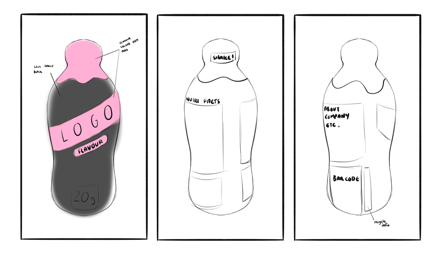
Thumbnail Sketches

Visual Elements


For my graphical elements, I did not want them to be too overwhelming, thus I created vector artworks in Illustrator that would pair along with the typographic elements. Here I develop a vector portrait based off the Lucida font family designers, Kris Holmes and Charles Bigelow. As I had no access to printmaking materials, this turned out to be my own way of developing my own print-like visuals, minus all the lino-cutting and whatnot.


Many of my elements were developed in InDesign through utilising the pathfinder functions. For example, to clip this text to fit inside the rectangle shape elements, I converted the text to outlines and the proceeded to use the pathfinder to 'subtract' the leftover bits of text that were outside of the boxes.
Padlet Activity Submission
Week 9 | Group 2 Alyssa Berdar
The audience of the Crankt Protein Shake is those who exercise and go to the gym.
The strategy used to convey this is the solid black paired with the contrast of the yellow and powerful typeface used.
This product would generally be seen in the refrigerated section in supermarkets as it is a beverage.
There are 4-5 typefaces used- heading, subheading, nutritional info, the freedom logo, and the circular stamp seen above the word Crankt.
Most of these typefaces appear decorative, most notably the Crankt logo, though most are sans fonts.
They relate to one another through being bold.
The designer utilised the space through setting the Crankt text to be diagonal across the product, rather than wrapping it around and forgoing size. This helps the product stand out through the large product name.
The effects used are a contrast between yellow, black and white, by outlining Crankt they clearly distinguish that it's the name of the product.
Other elements include the freedom logo, the barcode, and the dripping yellow colour.
The label is not necessarily aesthetic, but provides a rough and 'in-your-face' impression.
The use of type does not contribute to the efficiency of the label due to having multiple different typefaces fighting over one another to be in the spotlight. It is quite distracting.
Minimising the amount of types used might make the design less amateur
The logo will stay the same to preserve the pre-existing customers so they do not get confused, although altering other elements to be a little smaller such as the '20g protein' could also be done to use the space more effectively.
References
Bringhurst, R (2012) Chapter 6: Choosing and combining type (93-118) :: The elements of typographic style. Talisaspire.com. https://content.talisaspire.com/qut/bundles/604029c347e64316730f0cb4

